Responsive Master-Detail Layout in React
I am using React with React-Router to make a SPA(Single Page Application) recently. In my setting page, I adopted the typical Master-Detail layout.
It’s quite easy if you only need to make it work on desktop devices, but for small devices, you need to put extra effort into it.
This article describes how I implement the Master-Detail Layout which works well on both desktop and mobile. If you just want to see the end result, check out the demo project.
What is Master-Detail Layout
A Master-Detail Layout is a responsive layout that has a list of items on the left side (called the Master View) and has the selected item’s detail info on the right side (called the Detail View).
Master Detail Layout works best on large devices since the user can see both the master list and the detail view at the same time. If the screen is small, the user will only be able to see one view at a time and should be able to switch back and forth.
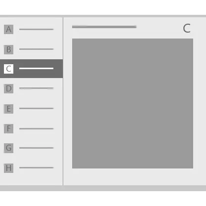
On Desktop
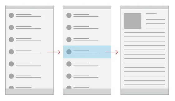
On Mobile
Mobile Header
Notice, when doing Master-Detail Layout on the mobile web, expect for the different layout, we also need to create a “Navigation Bar” to enable users to get back to Master View from the Detail View.
I call this bar as “Mobile Header”, it has the ability to display buttons on its left and right sides and present a title on the center:
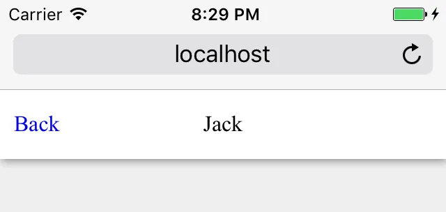
Mobile Header
Let’s begin with the Mobile Header (you can check out the source code):
import React from 'react';
import { Link } from 'react-router';
import style from './comp.MobileHeader.scss';

export default function MobileHeader(props) {
  return (<div className={style.container}>
    <span className={style.left}>
    {props.leftLabel ? (<Link to={props.leftLink}>{props.leftLabel}</Link>) : null}
    </span>
    <span className={style.middle}>{props.title ? props.title : null}</span>
    <span className={style.right}>
    {props.rightLabel ? (<Link to={props.rightLink}>{props.rightLabel}</Link>) : null}
    </span>
  </div>);
}

MobileHeader.propTypes = {
  leftLink: React.PropTypes.string,
  leftLabel: React.PropTypes.string,
  rightLink: React.PropTypes.string,
  rightLabel: React.PropTypes.string,
  title: React.PropTypes.string,
};
It’s quite simple, dummy and uses Link from react-router so that you can easily make the buttons as links.
Manually implementing Master-Detail Layout
When I first started to implement this layout, I came up with this manual approach in my mind quite straightforward:
Creating three routes for different situations:
/your_page: for desktop version including both master and detail views/your_page/master: for mobile version including only master view/your_page/detail: for the mobile version including only detail view.
And also you will create 5 components to build views for this three routes:
<MasterView /><DetailView /><PageForDesktop />: Will include master and detail views<PageForMasterView />: Will include master view and the mobile header<PageForMasterView />: Will include detail view and the mobile header
In addition, you need to somehow make sure all the links are correct on mobile.
My solution
So, the manual version is obviously unacceptable for me.
My goal about implementing this layout is that I want to create a layout component that will handle the responsive layout, and mobile page switching automatically, and also I don’t need to worry too much about the URLs that link to those pages that adopt Master-Detail Layout.
So instead of using different routes, I use a special URL query viewTypeOnMobile to indicate which view it should render and it only takes effect on mobile.
Also, the layout will take control of the <MobileHeader /> and can get access to the current page URL, so it will decide which button to render according to the current page.
Let’s take a look at the Master-Detail component:
import React from 'react';
import MobileHeader from 'app/components/mobileHeader/comp.MobileHeader';
import style from './comp.MasterDetail.scss';

export default function MasterDetail(props) {
  const {
    mobile,
    viewTypeOnMobile,
    masterView,
    detailView,
    mobileHeaderTile,
    mobileRightLabel,
    mobileRightLink,
    mobileLeftLabel,
    mobileLeftLink,
  } = props;
  const showMaster = !mobile || (mobile && viewTypeOnMobile === 'master');
  const showDetail = !mobile || (mobile && viewTypeOnMobile === 'detail');
  return (<div className={style.container}>
    {mobile ? <MobileHeader
      title={mobileHeaderTile}
      leftLink={mobileLeftLink}
      leftLabel={mobileLeftLabel}
      rightLink={mobileRightLink}
      rightLabel={mobileRightLabel} /> : null}
    <div className={style.content}>
      {showMaster ? <div className={style.master}>{masterView}</div> : null}
      {showDetail ? <div className={style.detail}>{detailView}</div> : null}
    </div>
  </div>);
}

MasterDetail.propTypes = {
  mobileHeaderTile: React.PropTypes.string,
  mobileRightLink: React.PropTypes.string,
  mobileRightLabel: React.PropTypes.string,
  mobileLeftLink: React.PropTypes.string,
  mobileLeftLabel: React.PropTypes.string,
  masterView: React.PropTypes.any,
  detailView: React.PropTypes.any,
  mobile: React.PropTypes.bool,
  viewTypeOnMobile: React.PropTypes.oneOf(['master', 'detail']),
};

MasterDetail.defaultProps = {
  mobileLeftLabel: 'Back',
};
The component is still simple and dummy, it passes props down to MobileHeader and provides props that let you decide which view it should render on mobile.
This is also one of the rules you should always follow when you develop with React
Keep your UI component dummy.
I create another component to handle the magic logic, which we call it as “container” (Notice I am using Redux):
import React from 'react';
import { connect } from 'react-redux';
import MasterDetail from './comp.MasterDetail';

function MasterDetailContainer(props) {
  const {
    viewTypeOnMobile,
    masterToDetailLabel,
    detailToMasterLabel,
    pathname,
    detailViewTitle,
    masterViewTitle,
    ...rest,
  } = props;
  const isMaster = viewTypeOnMobile === 'master';
  const mobileLeftLabel = isMaster ? null : detailToMasterLabel;
  const mobileLeftLink = isMaster ? null : `${pathname}?viewTypeOnMobile=master`;
  const mobileHeaderTile = isMaster ? masterViewTitle : detailViewTitle;
  let mobileRightLabel = null;
  let mobileRightLink = null;

  if (isMaster && masterToDetailLabel) {
    mobileRightLabel = masterToDetailLabel;
    mobileRightLink = `${pathname}?viewTypeOnMobile=detail`;
  }

  return (<MasterDetail
    {...rest}
    mobileHeaderTile={mobileHeaderTile}
    viewTypeOnMobile={viewTypeOnMobile}
    mobileRightLink={mobileRightLink}
    mobileRightLabel={mobileRightLabel}
    mobileLeftLink={mobileLeftLink}
    mobileLeftLabel={mobileLeftLabel} />);
}

MasterDetailContainer.propTypes = {
  masterView: React.PropTypes.element,
  detailView: React.PropTypes.element,
  masterViewTitle: React.PropTypes.string,
  detailViewTitle: React.PropTypes.string,
  viewTypeOnMobile: React.PropTypes.oneOf(['master', 'detail']),
  masterToDetailLabel: React.PropTypes.string,
  detailToMasterLabel: React.PropTypes.string,
  pathname: React.PropTypes.string,
};

MasterDetailContainer.defaultProps = {
  detailToMasterLabel: 'Back',
  viewTypeOnMobile: 'detail',
};

function mapStateToProps(state) {
  const viewTypeOnMobile = state.routing.locationBeforeTransitions.query.viewTypeOnMobile;
  const pathname = state.routing.locationBeforeTransitions.pathname;
  return {
    viewTypeOnMobile,
    mobile: state.browser.lessThan.tablet,
    pathname,
  };
}

export default connect(mapStateToProps)(MasterDetailContainer);
The container basically does two main jobs:
- read current URL info from the application state
- detect if current it is on a mobile device (or small screen)
- decide what should be rendered on the mobile header.
Master-Detail Layout signature
Now the Master-Detail Layout has been finished, let’s take a look at the signature:
<MasterDetail
  masterViewTitle="Master List"
  detailViewTitle="Detail View"
  detailToMasterLabel="Back"
  detailToMasterLabel="Go to Detail"
  masterView={masterView}
  detailView={detailView} />
It’s quite clear and easy to use, and most of the time you don’t need to know about the magic URL query viewTypeOnMobile.
Example of using Master-Detail Layout
Now I will use the MasterDetail to implement a list page (check out the demo), it looks like this:
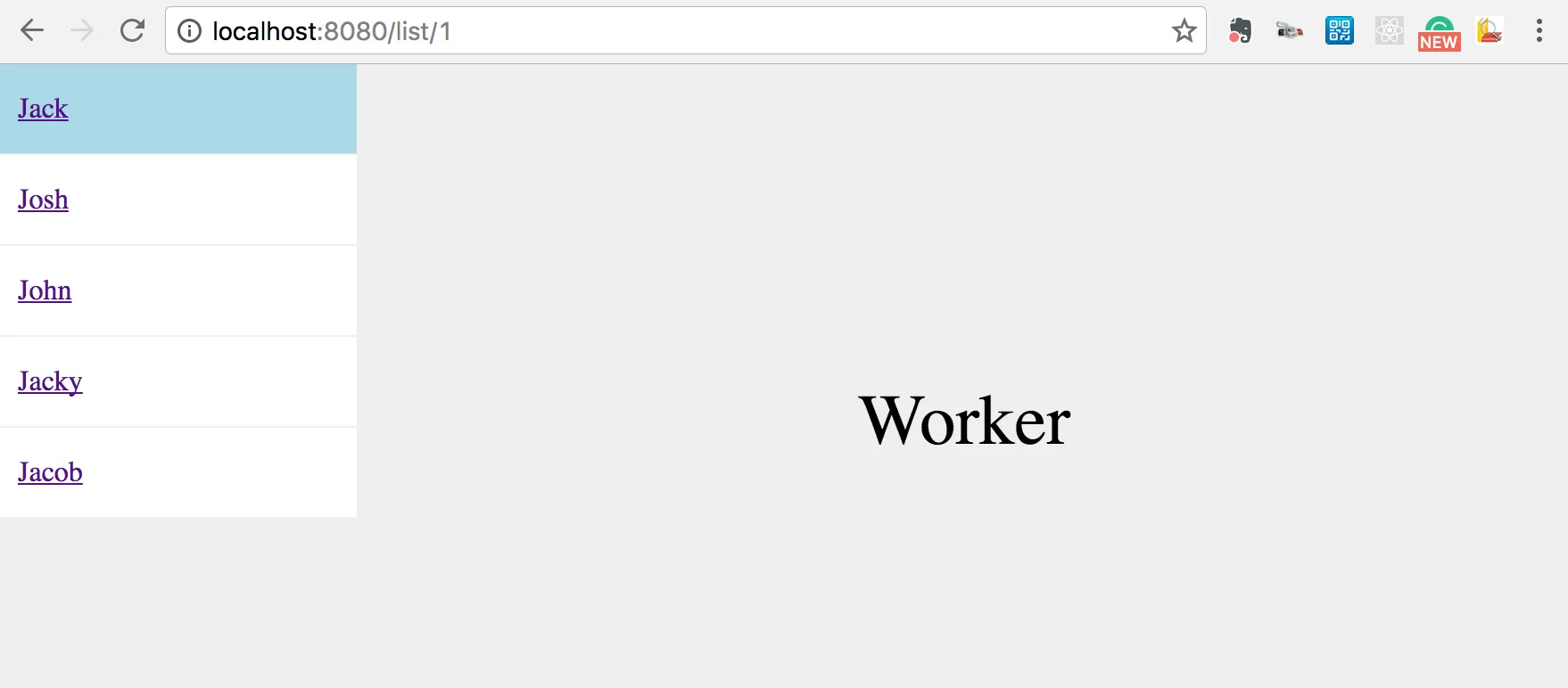
On Desktop
The code is just simple:
import React from 'react';
import { Link } from 'react-router';
import MasterDetail from 'app/components/layout/cont.MasterDetail';
import style from './comp.List.scss';

export default class List extends React.Component {
  constructor(props) {
    super(props);
    this.state = {
      list: [
        { id: 1, name: 'Jack', job: 'Worker' },
        { id: 2, name: 'Josh', job: 'Vendor' },
        { id: 3, name: 'John', job: 'Dancer' },
        { id: 4, name: 'Jacky', job: 'Cook' },
        { id: 5, name: 'Jacob', job: 'Driver' },
      ],
    };
  }

  getMasterView() {
    const id = parseInt(this.props.params.id, 10);
    return (<ul className={style.master}>
      {this.state.list.map(item => (
        <li key={item.id} className={item.id === id ? style.active : style.item}>
          <Link to={`/list/${item.id}`}>{item.name}</Link>
        </li>
      ))}
    </ul>);
  }

  getDetailView() {
    const selectedItem = this.getSelectedItem();
    return (<div style={this.state} className={style.detail}>
      {selectedItem.job}
    </div>);
  }

  getSelectedItem() {
    const id = parseInt(this.props.params.id, 10);
    return this.state.list.find(item => item.id === id) || {};
  }

  render() {
    const selectedItem = this.getSelectedItem();
    const masterView = this.getMasterView();
    const detailView = this.getDetailView();
    return (<MasterDetail
      masterViewTitle="List"
      detailViewTitle={selectedItem.name}
      masterView={masterView}
      detailView={detailView} />);
  }
}

List.propTypes = {
  params: React.PropTypes.object,
};
And if you shrink the screen size, it will automatically transform to:
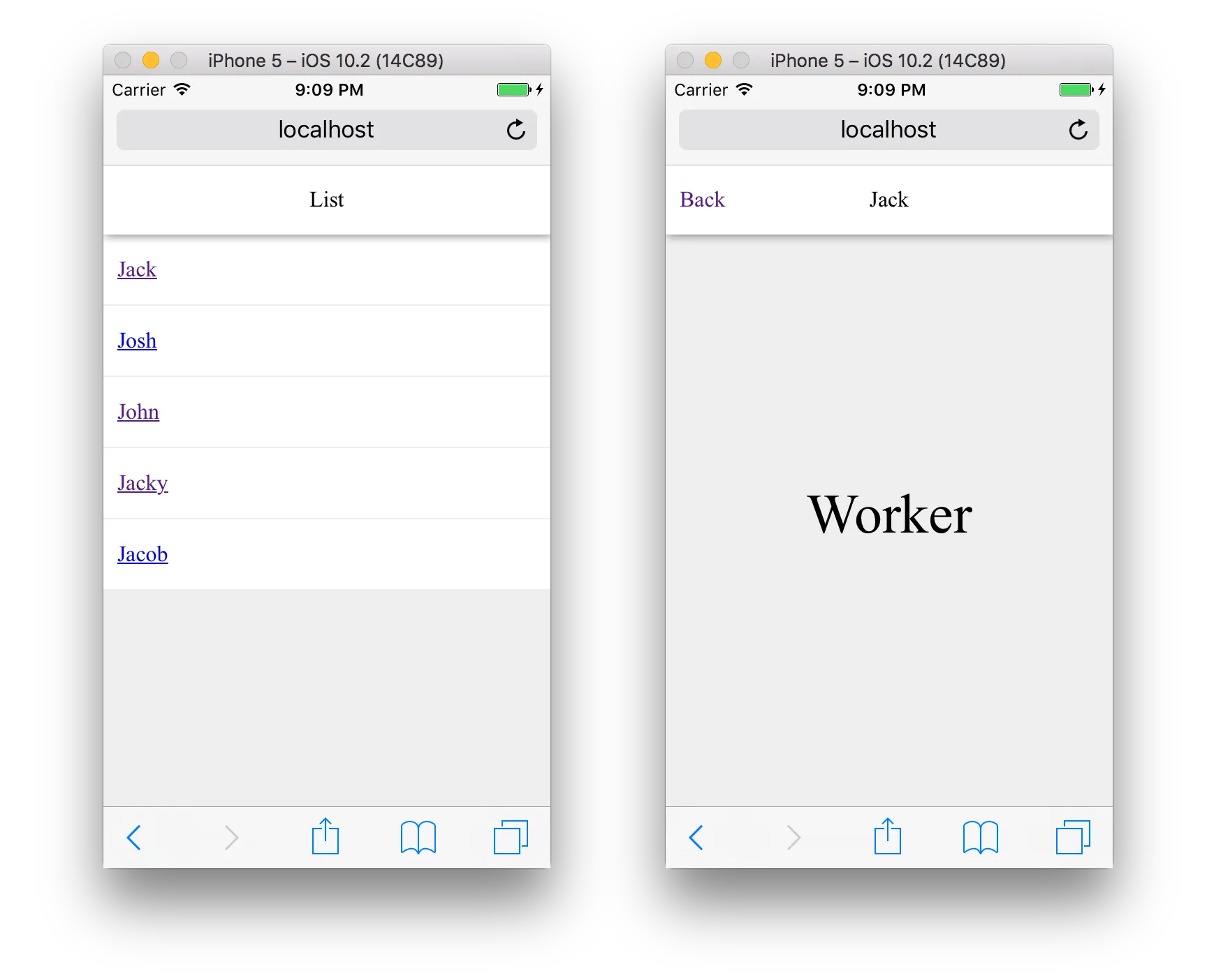
On Mobile
Basically, no extra work need to be done.
Caveat
Though I am already quite happy with the solution, it still has drawbacks you should know about:
- If your master list is actually a list of links (like a setting page, items are “profile”, “members” and “bills”. You still need to manual add URL query to the link, like:
/settings/profile?viewOnMobile=detail, to make sure it will render the detail view when on mobile. - If you are using
<Link />(fromreact-router) withactiveClassName, you will have the item selected on your master list even only the master list is rendered, because your real URL matched theLinkitem.
Comments